“It is very easy, red is red and blue is blue.” – The Color Kittens
“A red apple is a good example of subtractive color; the apple really has no color; it has no light energy of its own, it merely reflects the wavelengths of white light that cause us to see red and absorbs most of the other wavelengths which evokes the sensation of red. The viewer (or detector) can be the human eye, film in a camera or a light-sensing instrument.”—RGB World
Periodically I find it useful to step back from color and limit choice. Someone almost as famous as the Color Kittens once said, “Color is hard.” Color can be a lot of information, extra data not always necessary for telling a particular kind of story. Subtracting color can, as they put it on those reading comp tests from the third grade, help you choose “which sentence describes what this story is about.”
The story right now is about memory. My mother turns 90 this week, and I have been excavating for pictures in family photo albums and traveling through deep time. When I reach the place in the albums where photos change from black and white to color I can feel in my solar plexus a subtle shift, counterintuitively, to more thinking. My eyes have more to absorb, the focus literally is in my eyes, and I correspondingly think more and feel less. When I return to the black and white photographs I feel a kind of stillness and sense of deeper emotional reality.
As it was put on a recent Facebook thread about abstraction: “Abstraction is the felt resonance of the thing without the thing.” In the same way, reality abstracted to black and white or its close cousin, sepia, often conveys more of the felt resonance of a moment than does full color. The power of old black and white family photographs lies in their very lack of color, and the defects and the limitations of the medium in the pre-digital age. They are grainy, blurry and stained. While they leave room for memory and reverie they also feel like documentary truth. Compared to the thousands of digital pictures on today’s phones and social media, they are very few, and so they feel precious. Black and white snapshots from film cameras are also much closer to the original mechanics of photography: light activating a light-sensitive emulsion and creating an image. By freeing us so easily from mechanics, digital photography also sadly frees us from the sense of the miraculous, that photography is in fact light doing something extraordinary in capturing the ordinary.
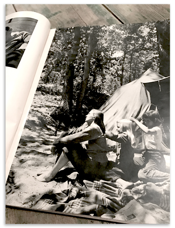
Sometime in early childhood I discovered Wayne Miller’s The World is Young. This book was at least as powerful as the The Color Kittens in shaping my world view. The photographs showed a life that looked like mine, in wrinkled pajamas, with messy house and messy hair, and with a mother who seemed real, kicking back in a wrought iron butterfly chair. In fact, when I think back to family vacations (of which we bizarrely do not have a single photograph) I think I superimpose Joan Miller over the campsite and just think of her as my own (and I get a little sister too!). Wayne Miller was best known for his photographs for Life Magazine and the work he did with Edward Steichen on The Family of Man. For me as a child his book was my first introduction to documentary photography, though I had no words for that. We treated the book casually and it is taped and cracked with use, but some part of me understood that what was in the book had importance. Somebody had made the ordinary moment transcendent, seemingly without effort.
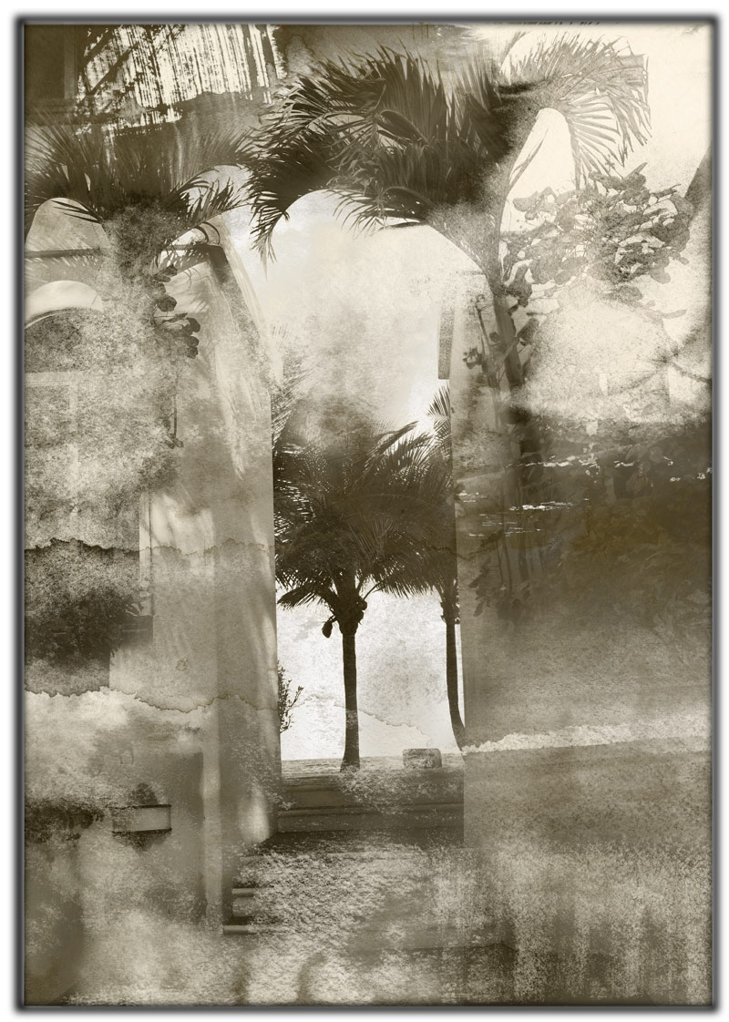
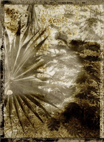
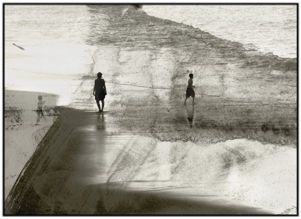
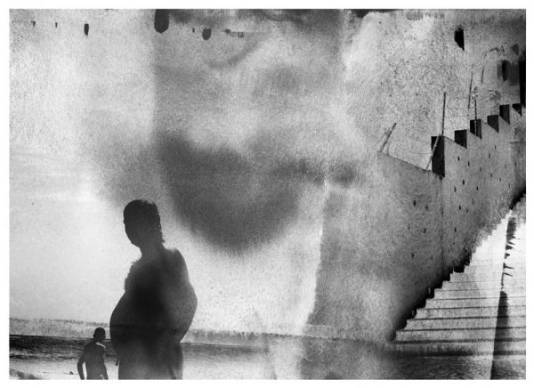
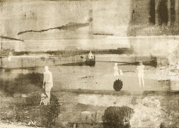
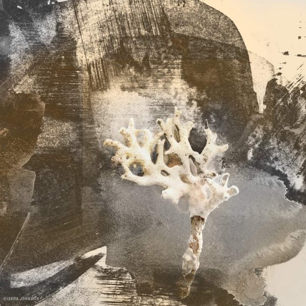
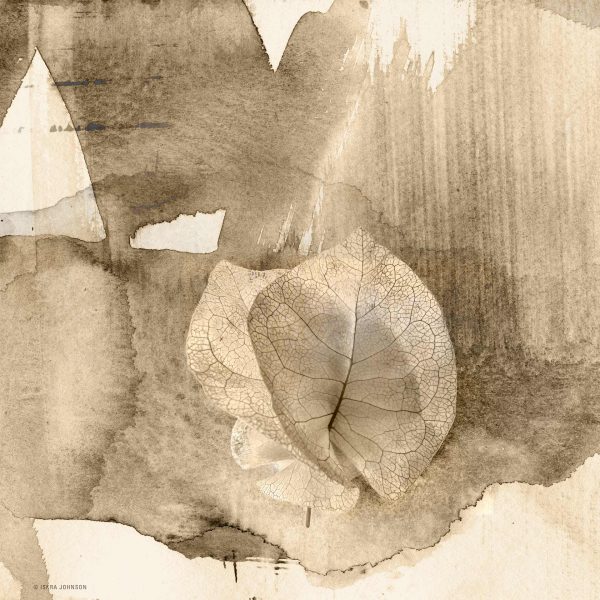
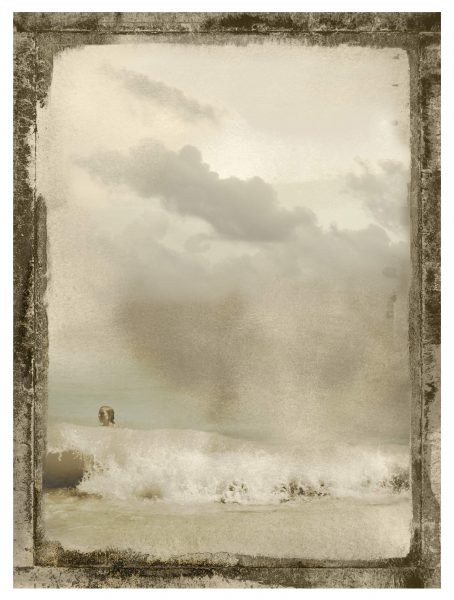
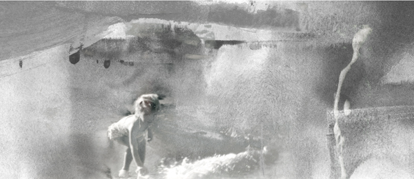
With these thoughts in the background, my latest work returns to thinking about “photographicness”: softness and focus, grain and error, over exposure, and darkness. Under the working title of “Nocturnes” I am exploring both figurative and industrial subjects, and will be developing several series along with full color prints over the next year. Gesture and painting is an important part of this work. I spend one morning a week painting spontaneous fields in watercolor and ink. I then sort through my collections of photographs and try out combinations, looking for compelling convergence between the real and the unreal, and blend media in imaging software to create my prints. The pieces here are from the “Tropics” series based on photography I did in the Yucatan in Tulum and Akumal.
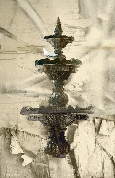
I am experimenting with various ways of treating edges that reference darkroom photography and the granular registration of printmaking on a press. Some images seem to benefit from a reference to the darkroom and the dark edge of unmasked “film,” others want to float unbordered. I am undecided on the effectiveness of this and would love your thoughts on the different treatments – please comment or drop me a note. If the story is history and the act of memory, how much, and how, should this be reflected in the presentation? I also welcome studio visits if you would like to see recent work in person. Most of the prints will be editioned in 10’s, in two or three sizes, up to 30 x 30 inches for squares, and 20 x 30 or slightly larger for others. (Click on the image to see it larger.)
Some people leave behind no good pictures, a life lived in uncatchable moments. But when they are gone, wherever you look, you see them.
If you would like to read more about the history of photography and modern interpretations you might enjoy an essay I wrote from awhile back on Takashi Arai and Ken Rosenthal. And if you are feeling restless you might check out some other posts about artist travels in Mexico. All of the work here is available now and will eventually be added to my shop, but it will not be formally launched until each series is complete.
All images © Iskra Johnson and may not be reproduced without permission.
del says
Brilliant! both the images and the words…tho ‘brilliant’ feels like an oxymoron for the deep and somber emotion that this evokes.
This slays me:
Some people leave behind no good pictures, a life lived in uncatchable moments. But when they are gone, wherever you look, you see them.