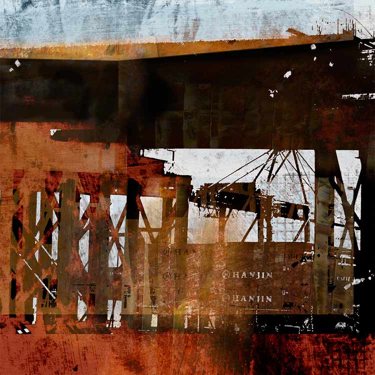
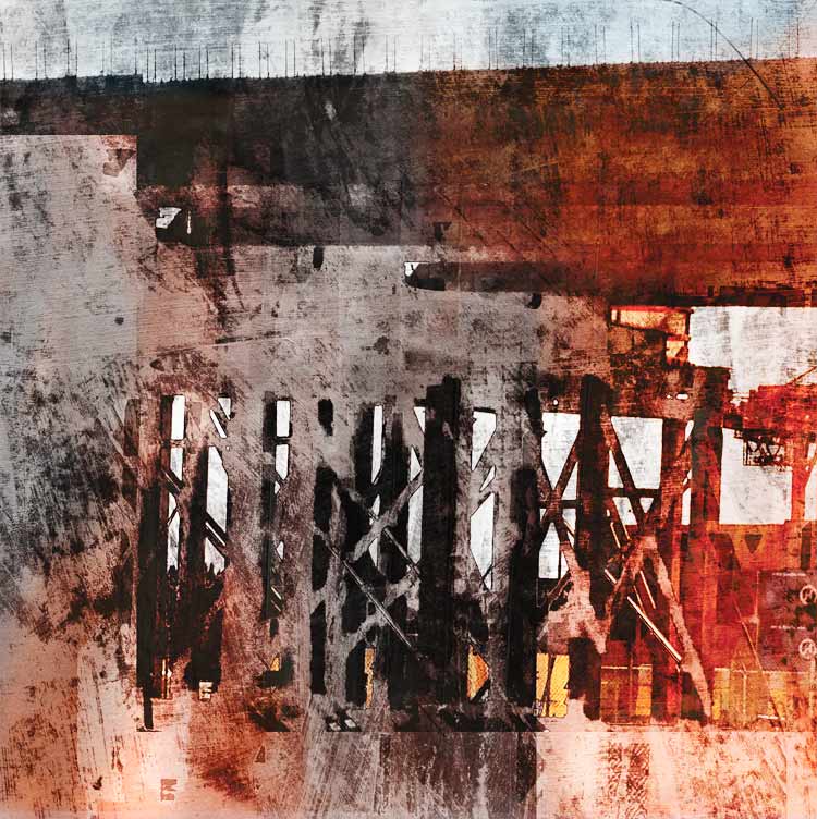
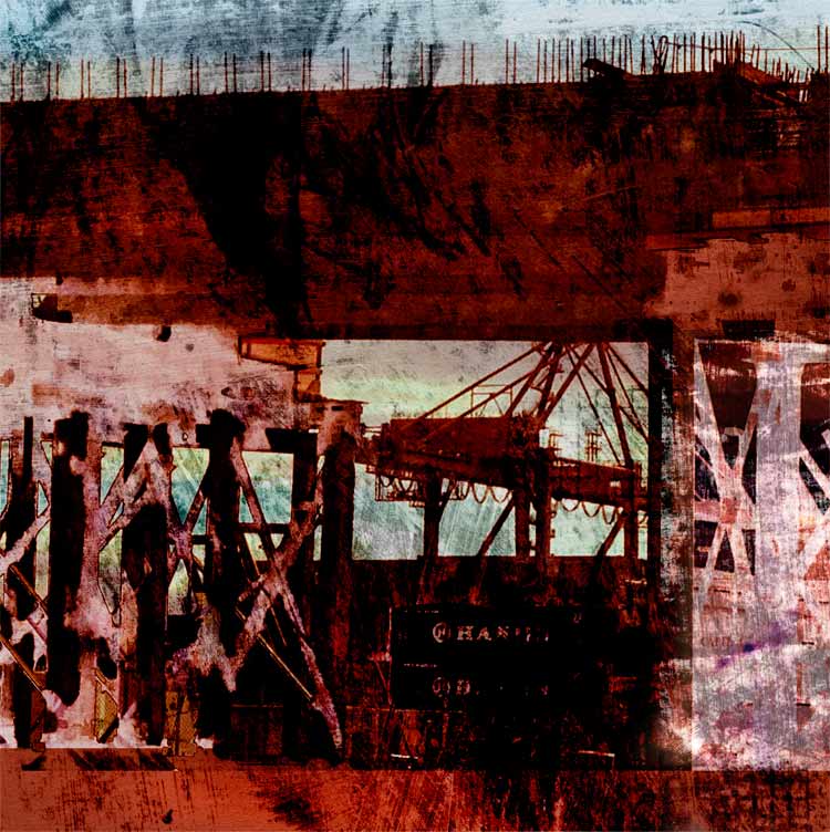
One of Seattle’s soon to be lost treasures is the Alaskan Way Viaduct. I had my office next door to it for eight years and learned to love and hate its noise and dirt and it’s hulking and fundamental “in-the-way-ness.” However, when one is not eye level from an office window cursing the dust and noise but rather on it or driving right next to it, perhaps at the golden hour, there are few more intoxicating sights than the Port and the great cranes and Elliott Bay glimpsed between its pillars.
This view is now complicated with additional intrigue by the Big Dig. If you love structures and infrastructure and seeing the bones of things, this is the place to be. I have taken hundreds of cellphone pictures on the drives to West Seattle and back, and have begun a project using these images called, quite literally, “Drive-By.” I am using digital media combined with painting to create what feel to me very much like old fashioned monoprints. I made monoprints for years using oil based ink on zinc, and I love the technique. It is a wonderful challenge to use digital technology with the same sense of play and spontaneity, using masks and layer effects to “wipe” the plate, and to print plates (translated as Photoshop layers) over each other, with infinite ability to adjust density and color.
Photography and print making are ideal ways to capture the sense of time flashing, of the way reality exposes itself on the retina and how then memory overlays one image onto another, like tissue paper through which color and a sense of the sky bleed through. In this case of course it is not just memory but motion itself creating the layers.
Three glimpses:
Drive-By Day Two: Cellphone Transfer Prints
I have not made any transfer prints in awhile, and it occurred to me that it might be the next step for these images. Cell phone resolution can be frustratingly chunky when printed large, but the transfer process takes natural advantage of soft blurs and ambiguities, and these images lend themselves to a tactile surface and intimate scale. On these two I used Apollo transfer film on hot press watercolor with spray alcohol (92%). It’s counter-intuitive, but for some reason the temperature today in the studio, which nearly matched that of the alcohol, seemed to help the process along.
It feels wonderful to surrender to color. I fell in love with Maxfield Parrish’s clouds in a junk shop when I was in the sixth grade. Ash Grove Cement might as well be a neo-Greek column, and that shape in the middle could be a neo-nymph looking up in reverie at plumes of steam. Who says industry isn’t romantic? And who can resist a name like “Ash Grove?”
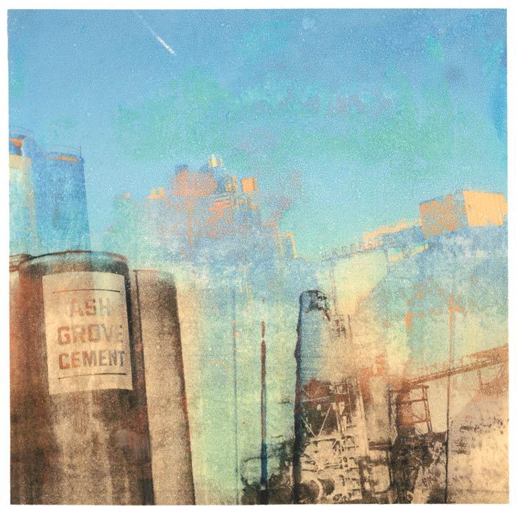
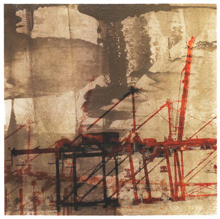
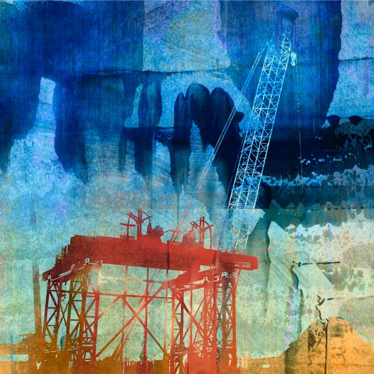
(Not yet printed, but I thought I would include it here to show the surface difference between the native image and prints with similar imagery.)
See more artwork on industrial themes at the print portfolios for Construction/Reconstruction and Infrastructure.