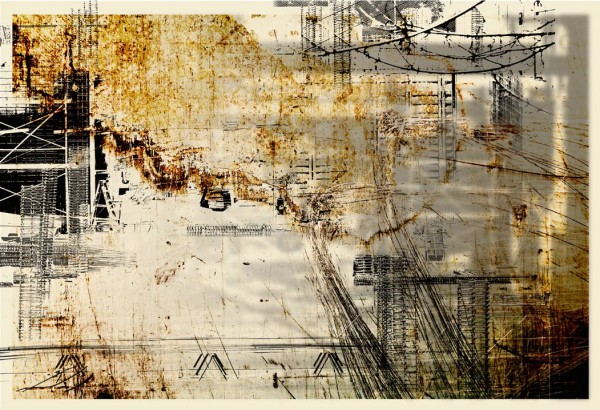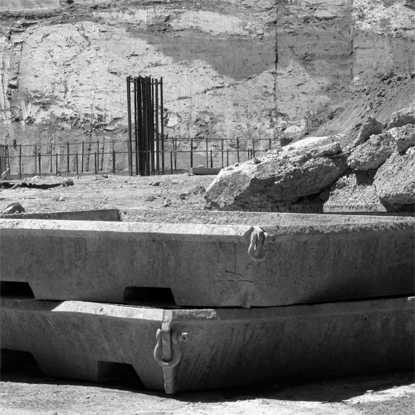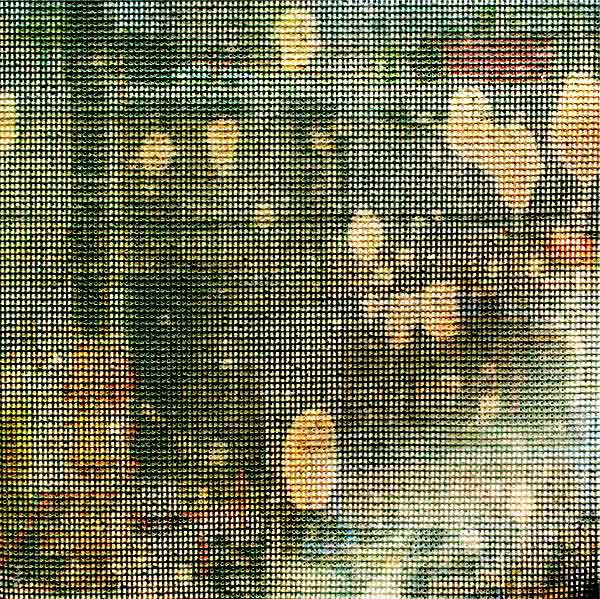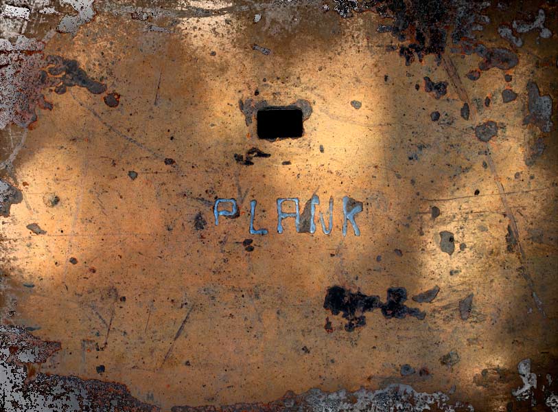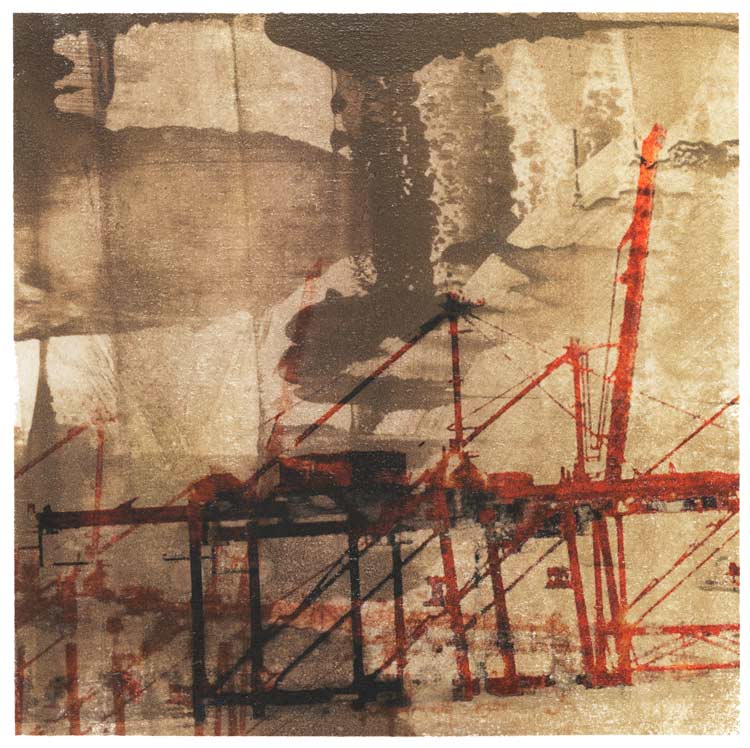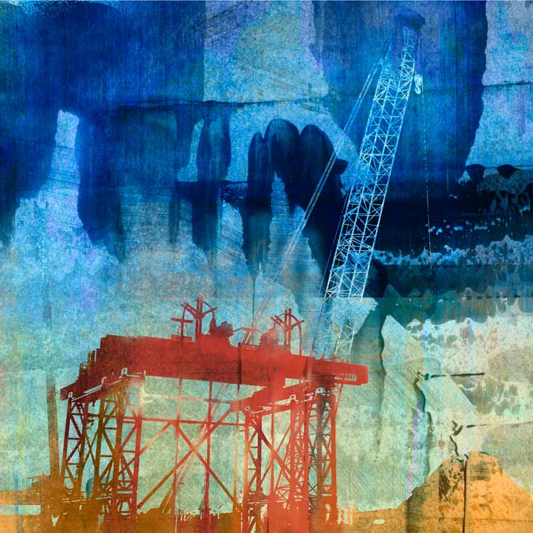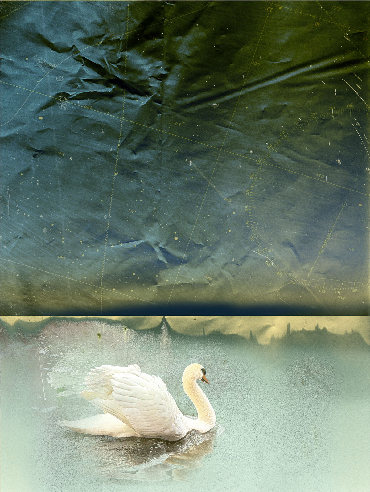
I have started a new set of prints about urban displacement and place, titled “Dwell.” Here are the first images, as I look at a city in flux through different visual languages.
I photographed my first construction site over 30 years ago. At least three men with bullhorns shouted at me as I walked a long gangplank into the center of an open pit the size of a city block. I could not resist the bright red ladders, the spiking rebar and randomly thrown coils of wire, the orange triangles and cones and wooden spools, the augurs and blades – all massed against a landscape of mud brown and gray. The scene spoke of the chaos phase of creativity, when shape and sense are only dimly glimpsed, and anything is possible. Not to mention that it was BIG. A few months later the newspaper carried a piece about a woman in an evening dress with a cast on her arm who was found, drunk and asleep on a beam in the unfinished 6th story. It occurred to me then that not for nothing do they measure skyscrapers in “stories.”
My fascination with monumental structure, excavation, history, surface and the ambiguous terrain between ruin and renewal has continued as our world has moved into a phase of urban development in hyperdrive. You can visit any city in the world and see the unmistakeable filigree of orange cranes rising above the skyline. The new landscape incorporates an ever-changing theater of half-walls, scaffolds, massive draperies and open pits girded by barriers as interesting as what is behind them.
The photographs here reflect the influence of the theory of wabi-sabi: nothing lasts, nothing is finished and nothing is perfect. And within this recognition lies a very particular kind of beauty. Purely documentary photographs form the basis for much of my work in the series Construction/Reconstruction although I often obscure or alter them beyond recognition in the process of collage. The images in this new portfolio stand alone as photographs, a record of a singular time and place. Archival pigment prints are available in a range of sizes.
See more at: Construction Site Photography
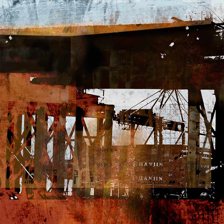
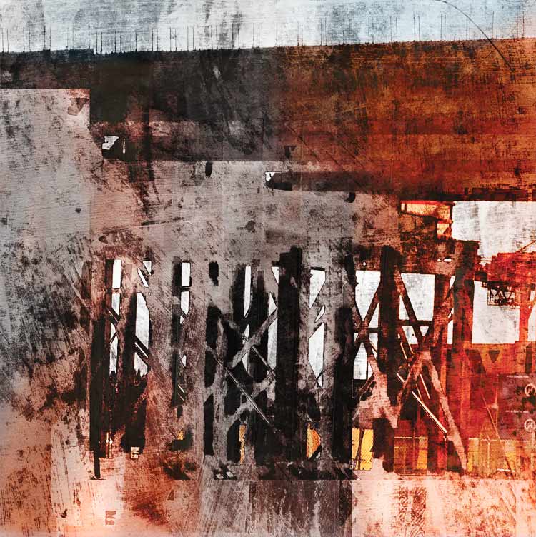
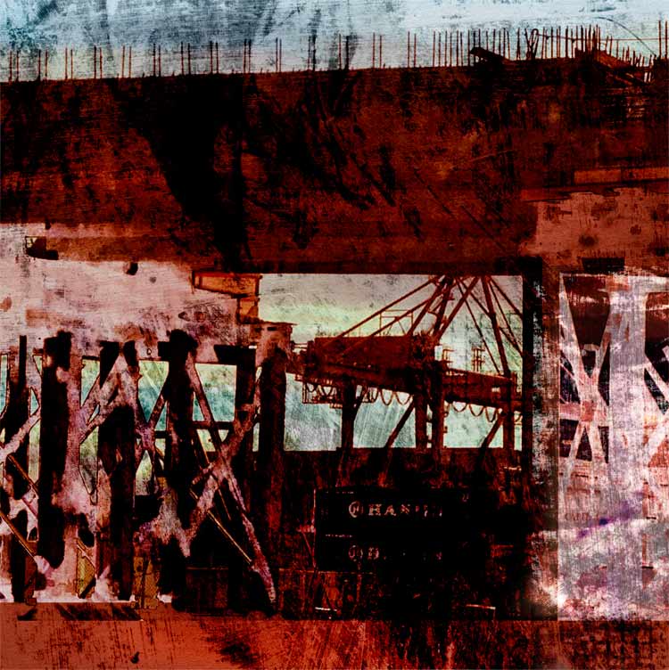
One of Seattle’s soon to be lost treasures is the Alaskan Way Viaduct. I had my office next door to it for eight years and learned to love and hate its noise and dirt and it’s hulking and fundamental “in-the-way-ness.” However, when one is not eye level from an office window cursing the dust and noise but rather on it or driving right next to it, perhaps at the golden hour, there are few more intoxicating sights than the Port and the great cranes and Elliott Bay glimpsed between its pillars.
This view is now complicated with additional intrigue by the Big Dig. If you love structures and infrastructure and seeing the bones of things, this is the place to be. I have taken hundreds of cellphone pictures on the drives to West Seattle and back, and have begun a project using these images called, quite literally, “Drive-By.” I am using digital media combined with painting to create what feel to me very much like old fashioned monoprints. I made monoprints for years using oil based ink on zinc, and I love the technique. It is a wonderful challenge to use digital technology with the same sense of play and spontaneity, using masks and layer effects to “wipe” the plate, and to print plates (translated as Photoshop layers) over each other, with infinite ability to adjust density and color.
Photography and print making are ideal ways to capture the sense of time flashing, of the way reality exposes itself on the retina and how then memory overlays one image onto another, like tissue paper through which color and a sense of the sky bleed through. In this case of course it is not just memory but motion itself creating the layers.
Three glimpses:
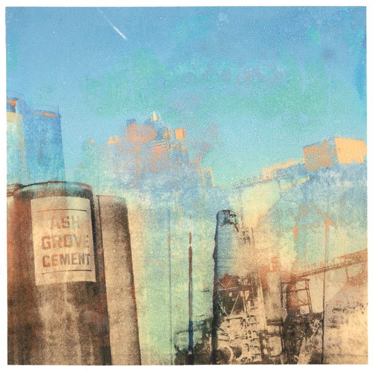
I have not made any transfer prints in awhile, and it occurred to me that it might be the next step for these images. Cell phone resolution can be frustratingly chunky when printed large, but the transfer process takes natural advantage of soft blurs and ambiguities, and these images lend themselves to a tactile surface and intimate scale. On these two I used Apollo transfer film on hot press watercolor with spray alcohol (92%). It’s counter-intuitive, but for some reason the temperature today in the studio, which nearly matched that of the alcohol, seemed to help the process along.
It feels wonderful to surrender to color. I fell in love with Maxfield Parrish’s clouds in a junk shop when I was in the sixth grade. Ash Grove Cement might as well be a neo-Greek column, and that shape in the middle could be a neo-nymph looking up in reverie at plumes of steam. Who says industry isn’t romantic? And who can resist a name like “Ash Grove?”
(Not yet printed, but I thought I would include it here to show the surface difference between the native image and prints with similar imagery.)
See more artwork on industrial themes at the print portfolios for Construction/Reconstruction and Infrastructure.
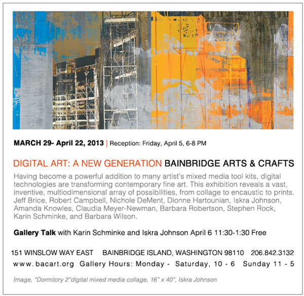
Tonight is the opening for “Digital Art: A New Generation” at Bainbridge Arts & Crafts. I will be showing two transfer prints from the Natural World series and two prints from Construction/Reconstruction. Above is the image used for the postcard, which is the largest print I have done to date. It is inspired by the idea of walls, and the drama of inner and outer space that construction sites evoke before they become completed buildings. The University of Washington dormitory project has been a subject of fascination for me for months. This image was developed from photographs taken on the University Bridge while the scaffolding was up and the building was draped. Gotta love a multi-story building with a veil.
Well this is exciting! It is a rare and wonderful thing to have work reviewed in a real live paper newspaper. Check out Michael Upchurch’s piece here. It is good to see Norman Lundin’s Prographica get the appreciation it deserves, and I am pleased to be mentioned. Here are two of the pieces he discusses, from my Construction/Reconstruction series. The show continues through March 9th, open Wednesday – Saturday 11-5.
Postscript: I had some time today to visit Dianne Kornberg’s work online. Her pieces in “Bleak Beauty” are all gelatin silver print photography, but she has a an entirely different body of work on her website. It is intense, adventurous, and technically brilliant. I love her printmakerly sense of surface and color. Take a look at Dianne Kornberg’s body of work here.
I also am very drawn to Steve Costie’s fine graphite drawings and have been enjoying seeing his work in exhibits around town. His work is very rigorous and at the same time poetic within its constraints. His sensibility and interest in structure feels very congruent with my own. His work inspires me to keep following the architectural muse.
Additional artist website links: Sandow Birk, David Bailin. Both of these artists draw like angels, with a deep and highly skilled apocalyptic vision. Very real, very reflective of the darker sides of the world today.