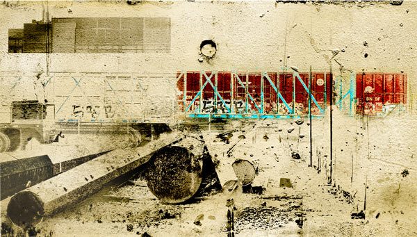
The big puzzle in my studio life right now is how to maintain access to intuition while working in the highly technological medium of digital print making. As someone coming from traditional printmaking, and particularly monoprint, I prize the excitement of accidents and transformations not entirely in my control. And the things I look at obsessively, like the sides of dumpsters and the backs of stop signs, are surfaces of completely unintentional beauty. To get this feeling of things — to get the reality, more importantly — it’s essential to embed in the workflow some wild cards. The images I have been doing recently are taking radical new turns, and it’s because I have been taking risks and learning how to embrace chaos.
What is Digital Printmaking?
First, for those reading who may think of digital printmaking as simply scanning a painting and printing it from a computer, or using a mouse or stylus to draw, a brief explanation. Photoshop allows any image to be taken apart and reassembled into constituent parts. It operates on a system of layers that can each be subjected to “layer effects” that change color, density, value, line quality, texture and positive negative relationships. It allows for drawing and painting marks and tones as well, although my own choice is to make most marks by hand or to use photographs of found textures. A digital printmaker uses Photoshop layers like plates in the printmaking process, building up images layer by layer until the work is complete. Then the image lives either in cyberspace viewed on monitors, or is printed on paper or another substrate.
Even after five years I still spend hours each month Googling for obscure tutorials and banging my head against the embedded math of pictures made of pixels. I still take obsessive notes and make countless proofs. But slowly I am beginning to feel like a native. Partly this is because of the perverse beauty of the words that describe the digital image process.
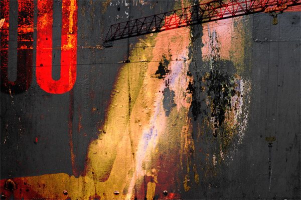
“Gamut,” for instance. I can spend a whole day working on an electrifying image only to discover that it will never print properly because it is “out of gamut.” That phrase seems to describe my mind, and I’ll gladly take it. Then there are the names of layer effects in Photoshop. Who could resist taking a spin with “linear light?” or “luminosity” or diving off the deep edge with “difference” or “exclusion?” These are words for poets and dreamers, not engineers. Sometimes I allow myself to try out every single combination of everything, working faster and faster between actions until I have NO IDEA what I have done. That’s usually when it gets really interesting. As a calligrapher I always relied on variations on speed and slowness to change the character of the marks I made. Along with that, I had the texture of paper and the softness or hardness of my brushes. A computer monitor has no texture, so it’s a bit of engineering to to make slickness stutter. I use multiple layer effects, channels and masking to keep the computer’s fingerprints as invisible as possible.
More than the technical chops though, the most important element for finding intuition on the computer is frame of mind. I come to art-making through words, and the writing life is always where I go to shake up my process. Following the same model as writing practice, I have started doing what I call “morning pages” as soon as possible after I wake up. I sit at the computer after a cup of tea and writing in my journal, and then instead of meditating I start improvising in Photoshop, while keeping my attention on my breath. No music, and the dimmest of goals, knowing only that I want to not-know, and trust the not-knowing. Usually after an hour or so I have something that surprises me. Part of a corner may actually be dazzling. The rest may be a mess. I put it away and go back to the intentional images. And soon I find the mysteries of the morning informing the “real” work.
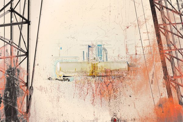
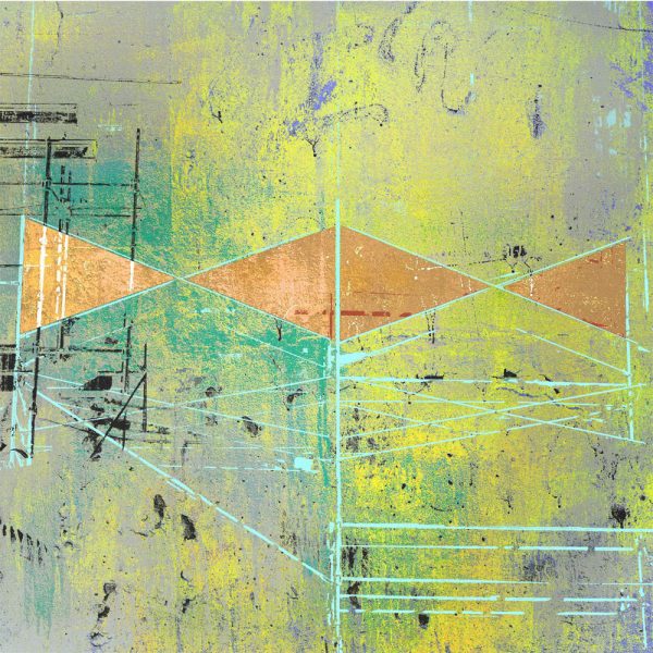
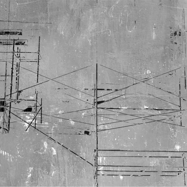
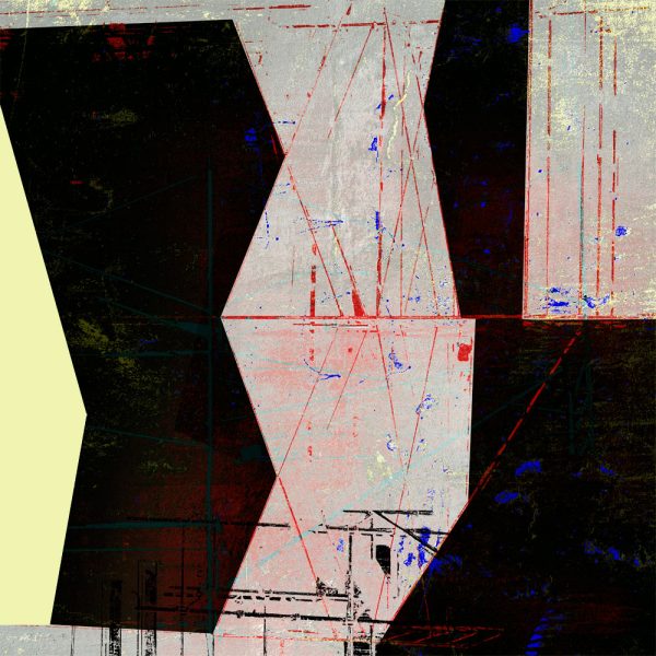
One of the interesting things about this is that metaphor sneaks in, just as it does in poetry (on little cat feet. . .). I have been brooding about scaffolds for about ten years. In a show called “Bleak Beauty” at Prographica several years ago I showed a print called “The Elegant Scaffold.” Now it has resurfaced, ready to be explored in a new way. Here are a few of the new pieces, some of which will be at SAM Gallery this fall in Industrial Strength.
These will be available in a collection called The Scaffold in my shop as a series very soon. The scaffold prints come in two sizes: 16 x 16″ on a 17 x 22″ sheet, edition of 25, $600 each; 24 x 24″ on 29 x 29″ sheet, edition of 10, $1,200.
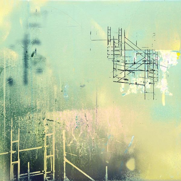
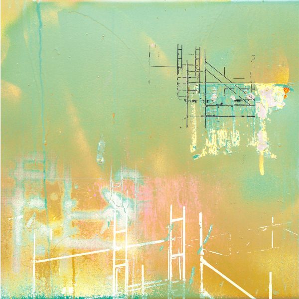
As with traditional printmaking using plates I approach each image as though I am mixing variations on color, rotating plates back and forth, making registration errors, wiping an image, overprinting, ghosting and etching.
Upcoming: Save the date for a show this summer commemorating the Ballard Locks. I will have a print in this show curated by Lisa Lady, opening Thursday August 17, from 7-8pm at the beautiful Beaux Arts Ballard Locks Administration Building.
Additional Inspiration: Take a look at the wonderful blog and letter press art by Myrna Keliher at Expedition Press. I have been very inspired by the story behind her recent work and her dedicated use of writing in her work.
Leah says
What a wonderful post…insightful and enlightening. Thank you for sharing your process.