Once a month I meet with a very special group of creative entrepreneurs to critique art in progress, celebrate completed projects and share spectacular food. Over the 14 years we have been meeting two of our members have moved out of Seattle to the Kitsap Peninsula, and so twice a year we caravan on a ferry to meet at their studios.
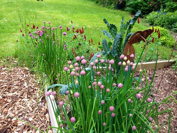
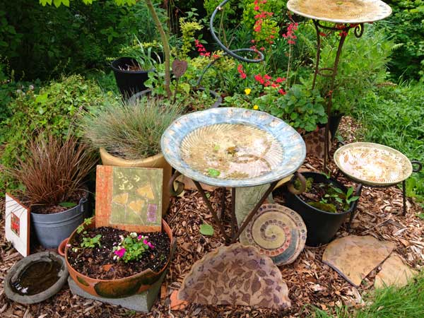
Last month we met in Bremerton, at the tile studio of Paula Gill. Paula works surrounded by a rambling country garden exploding with vegetables and bouquets. Everywhere you look there is something to make you smile. It was a beautiful day in an environment designed to nourish the spirit.
I have known Paula for many years and have been continually impressed by the breadth of her skills as a painter, printmaker and graphic designer. It has been a privilege to observe the process of her work as it has unfolded and moved in new directions. Here are some excerpts of our conversations about her work and her development as an artist:
How has your work changed in the last few years?
The primary focus of my artisan tile business for the past 15 years has been the design and production of colorful glazed decorative tiles with garden and nature themes that I sell at juried Art and trade shows, selected galleries and retail shops. Each tile is carved by hand; each is a one of a kind original, no molds are used. In the past several years, my focus has shifted toward exploring and experimenting with new techniques and imagery.
What is the connection for you between tile and printmaking?
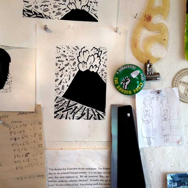
My background is in both relief printmaking and ceramics. Since I started making tiles 15 years ago, my “holy grail” has been to find ways of combining printmaking techniques with tilemaking. I began by using “v” and “u” gouges to create the linear elements in the tiles with a technique known as sgrafitto. I progressed to embossing carved linoleum blocks into tile forms, a technique called mishima- a process that involves inlaying a color into an indentation in the clay and then scraping off the surface color which reveals the pattern in the color left in the shallow part of the image.
Your early tiles were highly reflective, with a glossy glaze and poster-like primary colors. What has inspired your new work with the matte more painterly surface?
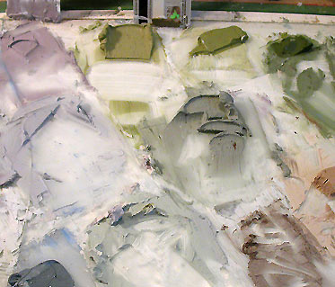
My next foray into the fusion of print making and tile was to create my own underglaze formula that I could apply like printer’s ink onto the surface of tiles with brayers; I can lay down multiple layers of color which creates richly textured surfaces. This led to a whole new body of work that I chose to leave unglazed. This formula has a lovely matte finish that when fired has the appearance of having been painted on with acrylic or oils. The first solo show using this technique was titled “Seeds: Meditations on Hope” in which I explored the metaphor of the Persephone myth.
You have been doing a lot of work about the coast recently. Why has Canon Beach become your muse?
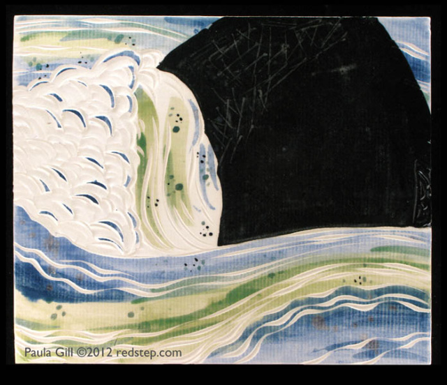
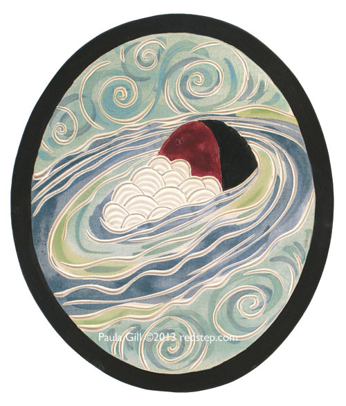
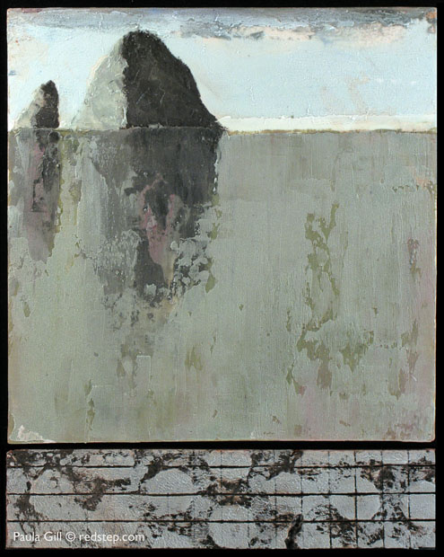
I spent 3 years of my childhood in Astoria, where I played for hours on the nearby coastal beaches. I reconnected with those happy childhood memories on repeated trips to the Oregon Coast as an adult. I am especially drawn to Cannon Beach and Haystack Rock. In the current Seascape series I explore the tension that human intrusion imposes on the pristine natural landscape by introducing mechanically manufactured textures into the composition, either as a separate tile to create a diptych, or as an integral element of the main image.
In the past few years you have done several 1% for art commissions and a massive hospital commission. Tell me about the hospital project and why tile is so suited to public art.
With the “Seeds” body of work I was accepted into Art in the High Desert, an outdoor juried art show in Bend, Oregon. I spent the entire extremely hot summer weekend sweating profusely, being mostly incredibly uncomfortable and to add insult to injury, I did not sell a single piece of the new work. An hour before the show was over on Sunday, when I was tired, hot, discouraged and ready to break down the show, a woman asked if the work was colorfast. Heat crazed, I offhandedly said, “Sure, they’ll be colorfast for about 10,000 years.” She then asked if I would be able to create hundreds of unique tiles for a hospital within 12 weeks. I quickly calculated that it would be absolutely impossible, but blurted out “No problem!” Within a month I had a contract to complete 176 one-of-a-kind 9″ x 9″ tiles for the patient rooms in a Southern California hospital. The theme of the hospital was “Healing with Nature.”
All the commissioned art in the lobbies, hallways, public spaces and patient rooms was focused on images of nature. I was given paint chips and fabric swatches. I created compositions with a focus on botanicals and symbols of life, energy, healing and wholeness. In order to meet the deadline, I worked around the clock, set up 2 new drying racks and used a friend’s kiln in addition to mine to speed up the firing process. I made the deadline and as the hospital expanded the following year, I was asked to create 60 more tiles for the additional wing. The beauty of the tile medium for public spaces is that unlike many painting mediums it is colorfast and can be displayed in even the brightest light without fading. This gives great flexibility for positioning the art in the environment.
Here are a few more pieces from the river series. If you are a print maker I think you will especially appreciate the paper-like texture in these glazes:
 You can find Paula Gill’s tiles on Etsy at numerous retail locations and at her primary website, Redstep Studio.
All images © Paula Gill or Iskra Johnson
Kristy Ewing says
Wonderful article about a wonderful artist. I love Paula’s work and feel that her creative endeavors get better and better every year.