Iskra Fine Art

  • Prints
    • The Tarmac Residency: Airport Landscapes
    • Immersions | At The Shore
    • ColorBath: Images of the Harbor
    • The Floating World
    • Industrial Strength | Urban Industrial Landscape
    • The Scaffold
    • Industrial Pastorale: The Rural/Urban Landscape
    • Botanical Prints | The Natural World
    • Construction | Reconstruction : Urban Landscape
    • Infrastructure
  • Drawings
    • Pencil Drawings: Pandemic Pause
    • Drawings in Dust 1
    • Signs & Symbols (Archive)
    • Botanical Drawings (Archive)
  • Photography
    • New Work Inspired by England
    • Seattle Waterfront Park Photography
    • Architectural Photography | Construction Sites
    • American West Landscape Photography
  • Mixed Media
    • Modern Botanical | Mixed Media on Plaster
    • From the Sea | Water Paintings
    • Sleep Studies
  • Wabi Sabi Abstract
    • Minimalist Modern
    • Ink Painting Abstractions
  • Shop
  • About
    • Contact
  • Blog
You are here: Home / Search for "transfer prints"

Search Results for: transfer prints

What is a Transfer Print? (Artist Statement)

April 26, 2012 by Iskra 4 Comments

In a transfer print the plate is created by printing files from a computer imaging program like Photoshop onto an acetate carrier sheet. For initial output I use an Epson 3800 with archival ink. After the carrier sheet is sprayed with a solvent  the ink becomes liquified enough to transfer to paper or another surface through careful burnishing. Alternatively the plate is pressed by hand or roller onto a sheet of paper that has been soaked with gel alcohol, a solvent that transfers the ink to the paper without harming the paper’s surface. Each paper takes the ink completely differently. Soft watercolor or printmaking papers may absorb the ink with a fair amount of predictability, while others react with magical surface qualities that have a life of their own. The effects range from the dry paper-texture of letterpress to a granulation similar to aquatint or the watery translucency of traditional monoprints.

It takes a great deal of repetition and attention to detail to pull one successful print. I have learned that timing, humidity, pressure, and subtle overprinting or vandalism of the same plate multiple times can all have an effect on the image and whether it succeeds. In many ways the moment of printing is like calligraphy in its exactitude, physicality and openness to the accidents of the moment.

The photographic transfer process allows me to work with the full-color lushness of photographic reality. Like traditional printmaking there is a plate, and it is hands on, but unlike traditional processes you can print all colors at once. I’m really trying to figure out where a photograph lives in the world now. I love the luminous intensity of photography when seen on screen, but when the computer shuts off the image is gone. Photographs on paper don’t have the same back-lit radiance, and unless they are very carefully printed on fine paper, they may feel less like a “print” and more like “output.” In some ways, with the dazzling improvements in retina display, the computer monitor version of a photograph may begin to feel more like the “original” and the paper print the lesser reproduction.  Our world now has trillions of images, with more being born every second, an endless stream of brilliant photographic candy flowing across our monitors and phones. The sheer volume and immediacy of images, the constant now leaves no time for absorption (or what used to be called “meaning”) and threatens to wear out our collective synapses. What can a print, a fixed piece of paper, offer in this new world?

I am interested in artifact, object, a thing of presence that arrests you, makes you pause, and puts you back in human-centered time. But I also think the human brain is being reconfigured by new technologies, and they can’t really be ignored. The way Photoshop builds images mirrors our minds and how we remember and layer experience. Photoshop also mirrors a printing press, with the ability to stack “plates” in layers, with each layer affecting the one below in truly magical ways that can only be done with this tool. What interests me is how the new media can be integrated with the old, the tactile with the digital.

The transfer process is time intensive and very sensual. Every inch of the image is transferred by the pressure of my hand as the damp paper takes the ink from the plate. It can take up to a dozen prints to get one that has just the right balance of subtle surface texture and ink density, and each print takes about an hour to completely transfer. The images layered into the final plate merge digital photographic elements, enlargements of older analog prints, and the other media I work in, such as powdered pigment and paint. It’s exciting to feel that two very different worlds can be integrated. Older ways of making are not “obsolete” — they can be revisioned and combined with the new in ways that reflect the complexity of what it is to be alive in this time.
Filed Under: Transfer Prints Tagged With: about transfer prints, digital printing, modern printing methods, monoprint, photographicness, photography, the camera's eye, the street, what is a transfer print?, work about the camera

Prints

Modern Digital Printmaking: Definition of Terms

The explosion of modern printmaking methods requires some definition of terms. The printmaking section of my site currently includes both Archival Pigment Prints and Transfer Prints. Both are contemporary methods of printmaking that use imaging software to create a digital file, which is the “plate” from which the print is made. Whether the image is layered with collage and mixed media or is pure photography, the only way it can exist as a physical object comes from being printed through a digital printer from the original file.

It’s important to note that this is very different from a “fine art reproduction” of a painting. In that case the “original” is the painting, and the “reproduction” is a second generation attempt to reproduce it. Fine art reproductions are often unsigned open edition posters, which may or may not be printed with long-lasting archival inks. With Archival Pigment Prints the print is the first and only generation.

How I Print My Work

My own background is in traditional printmaking with woodblock, etching and monoprints. I bring a printmaker’s sensitivity to paper and ink to all my digital art. Often when people see my prints in person they are mystified, because they can tell the imagery could only be made with the particular magic of digital composition, yet the tactile qualities are of silkscreen, lithography and serigraph. Surface is very important to me. I do all of my own printing of work up to a 17 x 22 sheet here in my studio, and it takes many proofs to get the exact color and interaction of paper and ink I am looking for. For larger prints I collaborate with The Color Group, a phenomenal Seattle company I have been working with exclusively for several years. We usually use German Etching, and the combination of the latest in Canon color technology with this paper is extraordinary. The ink has a physical quality that I have not seen with any other printer, and the colors are luminous and vivid. All of my prints use archival pigment inks. Lightfastness is guaranteed up to 100 years with proper care. As with all works on paper, such as photography, pastel or watercolor, you should keep them out of direct sunlight and protect with UV plexiglass or glass.

Some of my current work is done as a “transferprint.” This is a relatively new medium in which archival ink is printed from a digital device onto a special sheet of acetate and then hand-burnished onto a surface that has been coated with solvent. The resulting print is either a unique print or a variant edition of usually no more than three. Each print in the edition has some variation, and the granular surface shows the result of the hand process, with a luminosity and intensity of pigment unique to this process. The prints are lightfast and as archival as standard contemporary digital photography when appropriately framed. To read more about transfer prints go here.

What Does “Limited Edition” Mean with Digital Printmaking?

Currently my work is created in very limited editions of between 3 and 20 prints. Each edition is calibrated to a particular size and paper. In some circumstances images are offered in additional editions at alternate sizes, or in a different edition on an alternate paper. Each print is signed and numbered. One of the reasons I don’t currently offer large editions through online galleries is that I consider the signature an integral part of the art. I like to sign each print traditionally, in pencil, which is not an option with most online venues. I also like to be able to carefully control the quality of the prints.

The word “digital” is unfortunately sometimes associated with mass production or low quality. I am part of a growing movement among contemporary artists to create digital art that is finely crafted and bespoke. We give the same care and love to the work that involves computers as we do to our work in other media. If at some point I offer large editions of prints through an online gallery the images and/or dimensions will be different from the editions offered here through my website and studio, and I will aim for a similarly high quality product.

How to Purchase, and How Much Does a Print Cost?

I currently sell my prints through the SAM (Seattle Art Museum) Gallery and directly through my studio. SAM Gallery has a wonderful new space in the museum in the heart of downtown Seattle. One of the unique and very smart things the gallery offers is the option to rent art as well as purchase. Many companies and individuals start by renting art at a very affordable monthly rate and then decide to purchase, with the rental costs going towards the purchase. My print prices range from $300 for the smallest work to $1,800 –$2,500 for larger prints, and the cost is the same whether you purchase from the gallery or through me. If you choose to buy from me directly I can ship unframed prints to you if you are out of the area, or I welcome you to contact me for a studio visit, where you can see a large body of work and examples of framed work. Below are links to each set of work currently offered.

Airport Landscapes by Iskra

The Tarmac Residency

The Tarmac Residency is a series of work begun on an airplane, continued in an airport, and refined in studio. It is a laboratory testament to the immediacy of art and contemporary experience using cellphone technology, imaging software and the remembered poetry of place. These are limited edition prints in various sizes ranging from 7×7 inches to 30×30, available on Saatchi Art or directly through my studio.

Abstract Ink Painting

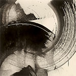
This series evolved from my long practice as a calligrapher, studying Japanese and Chinese ink painting and the many styles of kanji, hiragana, and katakana. I call this new body of work Jiyū, or “Freedom” in Japanese. In this series there are no recognizable words, but instead the language of pure abstraction. The process is wildly experimental and joyful, inspired by music and dance. I paint intuitively in ink and later recompose my gestures through digital layering, printing the final work in a range of palettes on canvas, paper, metal or other substrates. The work may be customized for residential and corporate interiors and is available to the individual collector as limited edition prints. 

Immersions

Water, Light, Summer: Dive In! A series of new media photographic prints inspired by the intersection of French Impressionism and modern approaches to photographic art. These images are available on canvas or paper, larger sizes available on SaatchiArt, smaller sizes and special orders available through my shop.

Colorbath Portfolio Iskra Johnson

ColorBath

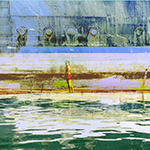
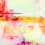
The ColorBath series is an immersion into color and light. In these large mixed media prints I explore the alchemy of reflection and refraction in the Pacific Northwest harbor.


Industrial Pastorale

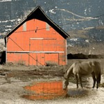
A series of work for a solo show that explores the edge between urban and rural landscape. The prints merge recent landscape photography from the Skagit Valley with urban surface to create visual narratives of rural archetype, contemplation and place.

Industrial Strength

Mixed Media photo art that combines original painting and photography in an exploration of the industrial landscape. Limited edition archival pigment prints on rag paper, canvas or metal, variable sizes.


The Scaffold

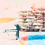
Abstractions of the industrial landscape. A scaffold is more than a practical way to get to the top of a building. It is a fascinating construction of lines in space. Limited edition prints in an elegant contemporary palette.


The Floating World

Images of the industrial waterways, inspired by Japanese wood block and the work of the 19th century artist Yoshitoshi. Different approaches to merging photographic reality with found surface. See the longer story of this work which began in a canoe trip down the Duwamish River here.


Construction

Construction/Reconstruction

Through photography and collage, architecture revisited in site-specific and abstract documentation. The beauty of a ruin is the mirror image of a construction site, as both reveal the making of things. Limited edition archival pigment prints on rag paper, variable sizes. More about this series can be found on my blog in the section titled Construction/Reconstruction.

Iskra Botanical Prints

The Natural World/ Botanical Prints

Inspired by my life as a gardener and a walker in the landscape, these images are composed of layers of pastel, watercolor and photography, digitally layered and printed as transfer prints or directly from an archival pigment printer onto paper.


Infrastructure

Infrastructure

Photo and digital collage that examines the beauty and structural underpinnings of the industrial environment. Limited edition archival pigment prints on rag paper, variable sizes.


Registering a Transferprint (Or how I came to realize the true sisterhood of calligraphy and printmaking.)

October 25, 2011 by Iskra Leave a Comment

This summer I did a lot of experiments with mounting transferprints on panels and sealing them with with every varnish, glaze and UV protectant ever invented. And in the end, wondering why I was trying to make paper be something other than what it is, I’ve gone back to tradition: the print floating in a pristine field of luscious, deckled rag white.

I realize why I had avoided it. It’s ridiculously difficult! The Arches is soaking wet with gel alcohol, the plate is flimsy and wants to buckle, and it is ready to deliver ink the second it touches down. You can’t hinge the plate to the paper because usually it is smaller than the paper, and tape will tear the surface anyway. I recalled from my other life as a calligrapher that one cannot do the character for Mujo perfectly without doing several thousand imperfect ones and throwing them away. And one can’t load the brush without ink, which must be ground, and then one must meticulously prepare the workspace with felt and weights so the fragile ricepaper does not fly away. All this preparation may take an hour. And without it, torn and blotted paper, ink that dries to pale whispers, and a profound sense of being out-of-groove.

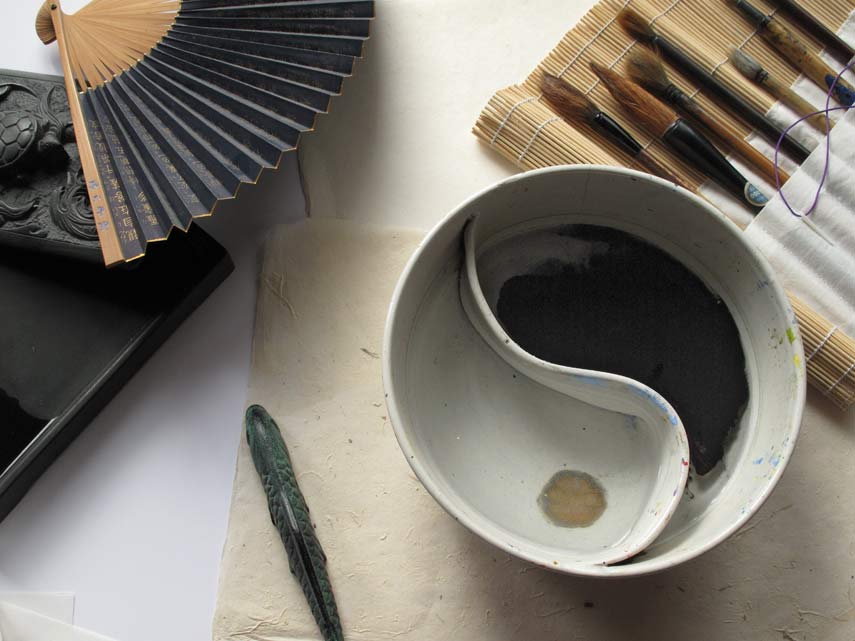
Tools Of Zen Calligraphy
Tools of Zen Calligraphy © Iskra Johnson

Printmaking groove requires the same precision and attention. Several years ago I visited Stephen Hazel at his Studio Blu, and the laboratory glare of perfection made me gasp. I don’t think there was dust anywhere in his zipcode. Thank you Stephen, for reminding me of the importance of order. Process = product.

To deal with the problem of the plates being smaller than the paper I bought large sheets of frosted mylar, which I hinged to my drafting table (which I covered with large sheet of plex.) I then drew various grids on the frosted side so I could position the plates, face up, to flop into correct position with even borders. I made an egregious technical error on one set-up, which was to place the plate on the frosted side, so the frosted mylar came into contact with the gel alcohol. The finish comes off over time and leaves a strange matte residue on the paper. 

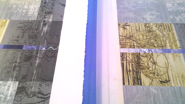
Hinging solves a lot of problems but not all. The deckle of a full sheet allows for some out-of-square possibilites, and I have to be very careful about how the paper lines up along the edge of the carrier sheet. The only tape I found that could reliably hold the hinge without going out of square after awhile was blue painter’s tape. Masking tape peels off the plexiglass and acetate too easily. And then…there is dirt. Hairs from the brush. Eyelashes, flywings, whatever can fall on that damp border of white paper will. I believe this is why the word “edition” means “pain” in certain languages, just as “danger” is supposed to equal “opportunity” at least according to those t-shirts at duty-free shops in Tokyo. Below, a finished print on the left, lined up to register with hinged plate on mylar on the right. *This was a quick photo and the finished print is placed upside down. It should mirror the plate.

Transfer-Print-Registration

Here is the first print done this way, not perfectly even borders, but getting close:


© Iskra Johnson, “Ode to StudioBlu”

Filed Under: Transfer Prints Tagged With: how printmaking is like calligraphy, how to make a transfer print, How to register a transferprint, printing without a press, registration without a press, Stephen Hazel StudioBlu

New Images About the Alaska Way Viaduct: Understory & Overstory

March 16, 2014 by Iskra 1 Comment

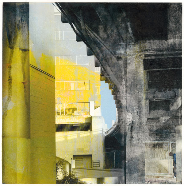
I have just completed several of the final new images for the upcoming “Excavations” show at Zeitgeist. One portion of the show will be a series of 10″ x 10″ transfer prints devoted to the ongoing saga of the Alaska Way viaduct. The images are created from my photographs of the viaduct layered with painted and drawn surfaces made in response. This is a place filled with industrial strength beauty: loud, dirty, sometimes hazardous but always provoking.

I have been photographing the viaduct for at least 25 years, and this iconic structure is an enduring object of affliction. Many of the collages are based on recent cellphone photos taken from a moving car. This is the glimpse, the rapture of the vista, the overstory. But this one, the most recent piece, uses as its backdrop an analog photograph I took over 20 years ago when the train tunnel could still be seen. I stood for hours one long gilded afternoon waiting for trains, and documented the graffiti as it changed color in the refracted sunlight of the bay. Now that tunnel is invisible, walled in behind condominiums. This is the understory. As with all of the images in this series reality has been subtly collaged and reconstructed.

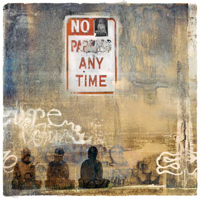
Banksy Was Not Here: Street Buddha Manifestation
Banksy Was Not Here: Street Buddha Manifestation, Transfer print, © Iskra Johnson
Understory 1
Understory 1, Saturday 1 PM, Transferprint, © Iskra Johnson

Meanwhile, although the cracks are getting larger we still drive. Best view of the sky anywhere:

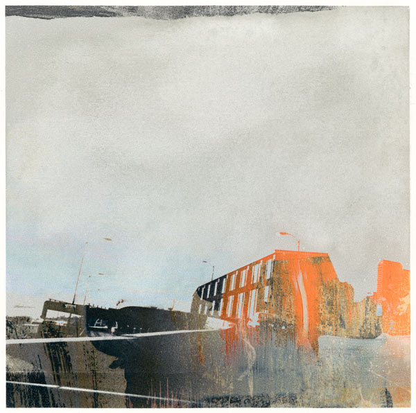
Drive-By In Orange: The Viaduct
Drive-By In Orange, Transferprint, © Iskra Johnson

Each transfer print originates from the same image, but the transfer process creates a unique monoprint each time, with different surface qualities and subtle variations in color. I often make only one print of an image, but in some cases the variations possible are too interesting to pass up. This particular print has several variants, as I experimented with the grain of the ink and application of the transfer medium. In this version I “wiped” the paper as I would a zinc plate, to get the organic washed quality of the sky.

Mark your calendar for the opening, First Thursday April 3rd, 6-8 at Zeitgeist. A reminder will come closer to the date.

Filed Under: Photocollage, Prints, The Alaska Way Viaduct Tagged With: Alaska Way Viaduct, graffiti in art, industrial art, Iskra shows, street art, street collage, tansfer prints, transferprint collage, understory in art, walls in collage, Zeitgeist coffee seattle

Opening tonight, “Digital Art: A New Generation” at Bainbridge Arts & Crafts

April 5, 2013 by Iskra Leave a Comment

Bainbridge Arts & Crafts Digital Art Postcard


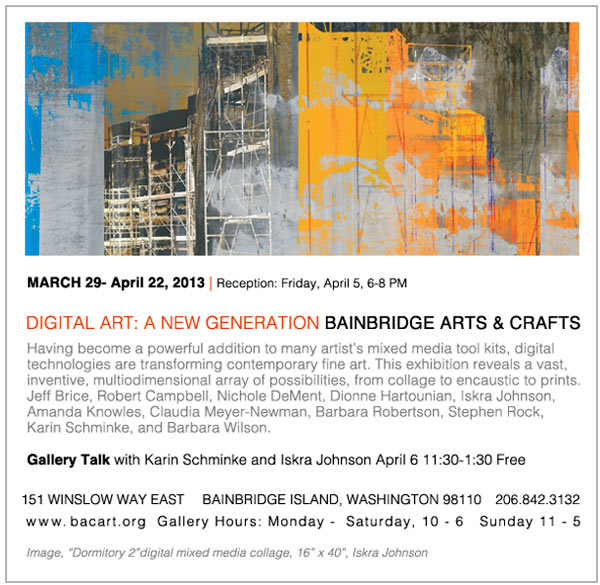
Tonight is the opening for “Digital Art: A New Generation” at Bainbridge Arts & Crafts. I will be showing two transfer prints from the Natural World series and two prints from Construction/Reconstruction. Above is the image used for the postcard, which is the largest print I have done to date. It is inspired by the idea of walls, and the drama of inner and outer space that construction sites evoke before they become completed buildings. The University of Washington dormitory project has been a subject of fascination for me for months. This image was developed from photographs taken on the University Bridge while the scaffolding was up and the building was draped. Gotta love a multi-story building with a veil.

Filed Under: Construction/Reconstruction, Iskra Shows, Upcoming and Past Tagged With: Bainbridge Arts & Crafts, Digital Art Show, Digital Art: A New Generation, Iskra shows

  • 1
  • 2
  • 3
  • …
  • 5
  • Next Page »

Join Iskra’s Mailing List

Don't miss a thing! Subscribe to receive show announcements, first peek at new work and my semi-monthly blog by email. I primarily use the blog for news and updates but by signing up you will also receive the occasional newsletter and special offers for items in my shop.

Iskra Fine Art Blog

the creative process | conversations with artists | the contemplative impulse in art

Instagram

Subtractive painting study and ground experiment: Subtractive painting study and ground experiment: I added baking soda to my gesso. Pretty wild texture here, not sure yet how stable it is. You can see the test of the edges in the second piece— the rugged edge only works if I get a pristine background and unfortunately the tape I used to mask it did not work consistently. Hello tape, my old friend and nemesis. You work differently on every surface. These little barn structures give me great comfort as the bigger structures of our government and nation seem to be crumbling.
Today’s landscape to quiet the mind. Out in the Today’s landscape to quiet the mind. Out in the fields somewhere, on the road to Edison. Acrylic on prepared ground, sketchbook.
MUST SEE! Ai, Rebel: The Art and Activism of Ai We MUST SEE! Ai, Rebel: The Art and Activism of Ai Weiwei at Seattle Art Museum.
I am thinking this morning about the phrase Americ I am thinking this morning about the phrase American Heartland. Learning to paint a barn means studying the neutrals. Our political discourse has pitted the barn people against the city people and there are no neutrals, just shouting. But if you walk out into the horizon lands, all you hear is the wind and a kestrel. Walk in boots, hard-pressed against your toes, walk on stubble barefoot and get acupuncture for a lifetime. Study the intervals: how the clouds can be in the upper one third neatly or one sixth, precarious, the future disappearing with the sun as it falls making the barn your whole world if you’re three years old and looking up; one big triangle with a square in the center, and so many mysteries inside the square. 

There is also the question of what kind of light seeps between the verticals and is the light coming in the evening or at midday when you can finally begin to make out all the other tiny squares within the big square, which would be called hay. Reach for the rope and swing out over the canyon, that great big canyon from bale to bale.

Collage studies: painting neutrals
A hybrid study, mixed process. Reading the New Yor A hybrid study, mixed process. Reading the New Yorker this morning, about the global population crash. This will upend urbanism, for sure, though it will very good for veterinarians and dog groomers:
“Only two communities appear to be maintaining very high fertility: ultra-Orthodox Jews and some Anabaptist sects. The economist Robin Hanson’s back-of-the-envelope calculations suggest that twenty-third-century America will be dominated by three hundred million Amish people. The likeliest version of the Great Replacement will see a countryside dotted everywhere with handsome barns.”
First Thursday. Such a beautiful night. First Thursday. Such a beautiful night.

Featured Posts

  • How to Purchase Artwork from Iskra Fine Art
  • About This Blog
  • New Directions in Contemplative Art: Conversations with Artists
  • What is a Transfer Print? (Artist Statement)

Categories

  • Abstract Calligraphy
  • Architecture & Sense of Place
    • Construction/Reconstruction
    • The Alaska Way Viaduct
    • The Water Tower Project
  • Art Reviews
  • Artist Studio Visits
    • The Mystic Muse: Artists Working in the Contemplative Traditions
  • Botanical Art
    • Botanical Art Cards
  • Collage
    • Digital Collage
  • Commissioned Art
  • Drawing
  • Essays
    • Object Lessons: Essays and images inspired by "A History of the World in 100 Objects."
  • Iskra Shows, Upcoming and Past
  • Iskra Sketchbooks & Journals
  • Living With Art
  • Meditation & Buddhism
  • Mixed Media
  • Painting
  • Photocollage
  • Photography
    • American West Landscape Photography
  • Print Sale
  • Prints
    • Transfer Prints
  • Seattle Iconic Landscape Prints
  • Social Media for Artists
    • The 100 Day Projects
  • The Garden
    • The Gardener's Almanac of Irreproducible Phenomena
  • The Spiritual in Art
  • Travel
    • Road Trips
  • Uncategorized

Archives

Search

Connect on Facebook

Iskra Fine Art Facebook Page

Creative Inspiration

  • Alternative Photography
  • An Artist's Retreat
  • Anonymous Chinese Textile Genius: Moo Won
  • Chocolate Is A Verb
  • Contemplative Art Process: Danila Rumold
  • Eva Isaksen
  • Old Industrial Japan
  • The Altered Page
  • The Heart Sutra Loop
  • The Patra Passage

Galleries for Contemplative Art

  • ArtXchange Gallery
  • Seattle Asian Art Museum

Links

  • CollageArt.org
  • Iskra at SAM Gallery
  • Iskra Fine Art on Houzz
  • Seattle Art Museum Blog
  • Seattle Artist League
  • Seattle Print Arts
  • Seeing Fresh: Contemplative Photography
  • The Painter's Keys

What I'm Reading: Online Magazines and Books I Love

  • 16 mi.
  • Essays by David Whyte
  • Evening Will Come: Poetry
  • Hyperallergic
  • Painter's Table
  • Shu: Reinventing Books in Contemporary Chinese Art
  • Streetsy
  • The Original Van Gogh's Ear Anthology
  • Tricycle Magazine
  • Unincorporated Persons in the Late Honda Dynasty
  • Vanguard

Let’s Connect

  • Contact Iskra
  • How to purchase artwork
  • Iskra Fine Art Blog : The creative process, conversations with artists, the contemplative impulse in art

Join Iskra’s Mailing List

Don't miss a thing! Subscribe to receive show announcements, first peek at new work and my semi-monthly blog by email. I primarily use the blog for news and updates but by signing up you will also receive the occasional newsletter and special offers for items in my shop.

  • Facebook
  • Instagram
  • Pinterest
  • Twitter

All Images Copyright © 2025  Iskra Johnson · Site by LND · WordPress