Iskra Fine Art

  • Prints
    • The Tarmac Residency: Airport Landscapes
    • Immersions | At The Shore
    • ColorBath: Images of the Harbor
    • The Floating World
    • Industrial Strength | Urban Industrial Landscape
    • The Scaffold
    • Industrial Pastorale: The Rural/Urban Landscape
    • Botanical Prints | The Natural World
    • Construction | Reconstruction : Urban Landscape
    • Infrastructure
  • Drawings
    • Pencil Drawings: Pandemic Pause
    • Drawings in Dust 1
    • Signs & Symbols (Archive)
    • Botanical Drawings (Archive)
  • Photography
    • New Work Inspired by England
    • Seattle Waterfront Park Photography
    • Architectural Photography | Construction Sites
    • American West Landscape Photography
  • Mixed Media
    • Modern Botanical | Mixed Media on Plaster
    • From the Sea | Water Paintings
    • Sleep Studies
  • Wabi Sabi Abstract
    • Minimalist Modern
    • Ink Painting Abstractions
  • Shop
    • The Water Tower Project
  • About
    • Contact
  • Blog
You are here: Home / Architecture & Sense of Place / Surface Queries and Technical Notes on Wax and Vanished Colors

Surface Queries and Technical Notes on Wax and Vanished Colors

October 8, 2015 by Iskra Leave a Comment

Attempting to mix a true match to the vanished quinacridone gold.
Attempting to mix a true match to the vanished Quinacridone Gold.

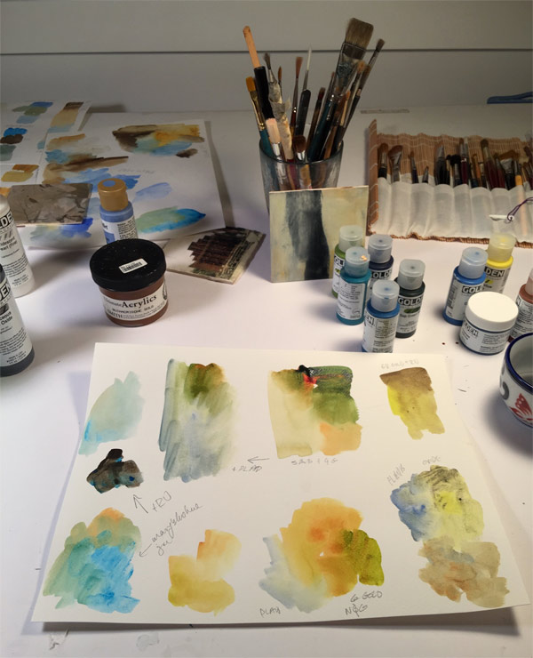
There are certain colors that just made life so much easier. Not to mention more luminous and radiant with saturated contentment and possibility, as if one were looking through a glass of lillet from a cafe in Firenze, just before dinner. Or surveying the vineyard from the ramparts, in a good year. And this color was not a cheap trick, although it could be used that way.

I am speaking, of course, about the dearly departed Quinacridone Gold, taken from us by unknown and sudden circumstance when I wasn’t looking. What you see above is my vain attempt to spin magic from earth colors, to replace a color originally used as dust on angel wings. Ochres, siennas, Azos, — pfft. Sorry Golden, I know you tried, but Azo is orange. I discovered after a panicked search that I have one nearly dried up jar of the original paint from 2007 (??) that I shall reconstitute and try to make last until the end times. Or I will just squint more and imagine that things looks as I should like them to. This new piece is underpainted with the beloved color and some other blends of earth and mica. Italy is but a dim memory here, muted by soot, but I wanted  Quin Gold here to give a hint of radiance to the industrial scene glimpsed from the bridge above Harbor Island.

Vie from the River, © Iskra Johnson, industrial landscape on plaster
View From the River, © Iskra Johnson, mixed media on plaster

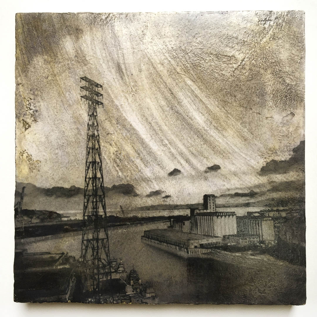
Image transfer onto rough and textured surfaces is not for the faint of heart. There is a lot of trial and error and holding one’s breath to move an image from photographic shimmer to an embedded life as an object. I think it is starting to work reliably, and I can begin to know how closely my imagery will translate. Now I am exploring the final finishes, and the technical issues of waxing over mixed media. Many of the craft solutions I have found online have no track record for longevity, so the scrapbooking community with its decoupage and furniture polishes has not been a lot of help on this.

When an acrylic resin is poured or painted over a surface it feels plastic and shiny, and for work with a textured field I want something more tactile. So far a satin wax from Stucco Italiano seems promising. I have also tried Renaissance Wax, Dorland’s Wax, and various of the Golden acrylic products, which never have the feeling I am looking for. Acrylic also tends to remain tacky forever, which makes shipping and wrapping complicated. On some of the Golden Acrylic resins I have used, like the tar and self-leveling gels, the Renaissance wax has seemed to help “cure” them so they are less fragile. But first the surface has to be scuffed with steel wool or another scrubber, and it tends to dull the colors. Both the Dorlands and Rennaisance don’t seem to “like” acrylic; they are finnicky, and sometimes come right off in burnishing. I welcome any suggestions from the surface fanatics out there. What can you put on acrylic to make it less shiny and more resilient, while keeping the brilliance of the color? What are your favorite final varnishes for mixed media (that won’t eat through paper or yellow over time?)

To unwind at the end of a day in the studio I have become a passionate fan of the Beautiful Italian Men Putting Plaster on Walls channel on YouTube. My new favorite form of “time-based art”: Italian men troweling plaster on walls with immaculate authority. To wordless soundtracks of lugubrious largos and antic allegrettos. Vivaldi never looked so good —I recommend it.

Man putting plaster on a wall, video still
A screenshot of a Man Making Art not War. Click here to see the video.


Filed Under: Architecture & Sense of Place, Mixed Media Tagged With: art technique, artprocess, italian plaster, mixed media, quinacridone gold, surface coatings, wax for acrylic

Leave a Reply Cancel reply

Your email address will not be published. Required fields are marked *

This site uses Akismet to reduce spam. Learn how your comment data is processed.

Join Iskra’s Mailing List

Don't miss a thing! Subscribe to receive show announcements, first peek at new work and my semi-monthly blog by email. I primarily use the blog for news and updates but by signing up you will also receive the occasional newsletter and special offers for items in my shop.

Iskra Fine Art Blog

the creative process | conversations with artists | the contemplative impulse in art

Instagram

Subtractive painting study and ground experiment: Subtractive painting study and ground experiment: I added baking soda to my gesso. Pretty wild texture here, not sure yet how stable it is. You can see the test of the edges in the second piece— the rugged edge only works if I get a pristine background and unfortunately the tape I used to mask it did not work consistently. Hello tape, my old friend and nemesis. You work differently on every surface. These little barn structures give me great comfort as the bigger structures of our government and nation seem to be crumbling.
Today’s landscape to quiet the mind. Out in the Today’s landscape to quiet the mind. Out in the fields somewhere, on the road to Edison. Acrylic on prepared ground, sketchbook.
MUST SEE! Ai, Rebel: The Art and Activism of Ai We MUST SEE! Ai, Rebel: The Art and Activism of Ai Weiwei at Seattle Art Museum.
I am thinking this morning about the phrase Americ I am thinking this morning about the phrase American Heartland. Learning to paint a barn means studying the neutrals. Our political discourse has pitted the barn people against the city people and there are no neutrals, just shouting. But if you walk out into the horizon lands, all you hear is the wind and a kestrel. Walk in boots, hard-pressed against your toes, walk on stubble barefoot and get acupuncture for a lifetime. Study the intervals: how the clouds can be in the upper one third neatly or one sixth, precarious, the future disappearing with the sun as it falls making the barn your whole world if you’re three years old and looking up; one big triangle with a square in the center, and so many mysteries inside the square. 

There is also the question of what kind of light seeps between the verticals and is the light coming in the evening or at midday when you can finally begin to make out all the other tiny squares within the big square, which would be called hay. Reach for the rope and swing out over the canyon, that great big canyon from bale to bale.

Collage studies: painting neutrals
A hybrid study, mixed process. Reading the New Yor A hybrid study, mixed process. Reading the New Yorker this morning, about the global population crash. This will upend urbanism, for sure, though it will very good for veterinarians and dog groomers:
“Only two communities appear to be maintaining very high fertility: ultra-Orthodox Jews and some Anabaptist sects. The economist Robin Hanson’s back-of-the-envelope calculations suggest that twenty-third-century America will be dominated by three hundred million Amish people. The likeliest version of the Great Replacement will see a countryside dotted everywhere with handsome barns.”
First Thursday. Such a beautiful night. First Thursday. Such a beautiful night.

Featured Posts

  • Book Launch! The Water Tower Project from Iskra Fine Art
  • How to Purchase Artwork from Iskra Fine Art
  • About This Blog
  • New Directions in Contemplative Art: Conversations with Artists
  • What is a Transfer Print? (Artist Statement)

Categories

  • Abstract Calligraphy
  • Architecture & Sense of Place
    • Construction/Reconstruction
    • The Alaska Way Viaduct
    • The Water Tower Project
  • Art Reviews
  • Artist Studio Visits
    • The Mystic Muse: Artists Working in the Contemplative Traditions
  • Botanical Art
    • Botanical Art Cards
  • Collage
    • Digital Collage
  • Commissioned Art
  • Drawing
  • Essays
    • Object Lessons: Essays and images inspired by "A History of the World in 100 Objects."
  • Iskra Shows, Upcoming and Past
  • Iskra Sketchbooks & Journals
  • Living With Art
  • Meditation & Buddhism
  • Mixed Media
  • Painting
  • Photocollage
  • Photography
    • American West Landscape Photography
  • Print Sale
  • Prints
    • Transfer Prints
  • Seattle Iconic Landscape Prints
  • Social Media for Artists
    • The 100 Day Projects
  • The Garden
    • The Gardener's Almanac of Irreproducible Phenomena
  • The Spiritual in Art
  • Travel
    • Road Trips
  • Uncategorized

Archives

Search

Connect on Facebook

Iskra Fine Art Facebook Page

Creative Inspiration

  • Alternative Photography
  • An Artist's Retreat
  • Anonymous Chinese Textile Genius: Moo Won
  • Chocolate Is A Verb
  • Contemplative Art Process: Danila Rumold
  • Eva Isaksen
  • Old Industrial Japan
  • The Altered Page
  • The Heart Sutra Loop
  • The Patra Passage

Galleries for Contemplative Art

  • ArtXchange Gallery
  • Seattle Asian Art Museum

Links

  • CollageArt.org
  • Iskra at SAM Gallery
  • Iskra Fine Art on Houzz
  • Seattle Art Museum Blog
  • Seattle Artist League
  • Seattle Print Arts
  • Seeing Fresh: Contemplative Photography
  • The Painter's Keys

What I'm Reading: Online Magazines and Books I Love

  • 16 mi.
  • Essays by David Whyte
  • Evening Will Come: Poetry
  • Hyperallergic
  • Painter's Table
  • Shu: Reinventing Books in Contemporary Chinese Art
  • Streetsy
  • The Original Van Gogh's Ear Anthology
  • Tricycle Magazine
  • Unincorporated Persons in the Late Honda Dynasty
  • Vanguard

Let’s Connect

  • Contact Iskra
  • How to purchase artwork
  • Iskra Fine Art Blog : The creative process, conversations with artists, the contemplative impulse in art

Join Iskra’s Mailing List

Don't miss a thing! Subscribe to receive show announcements, first peek at new work and my semi-monthly blog by email. I primarily use the blog for news and updates but by signing up you will also receive the occasional newsletter and special offers for items in my shop.

  • Facebook
  • Instagram
  • Pinterest
  • Twitter

All Images Copyright © 2025  Iskra Johnson · Site by LND · WordPress